
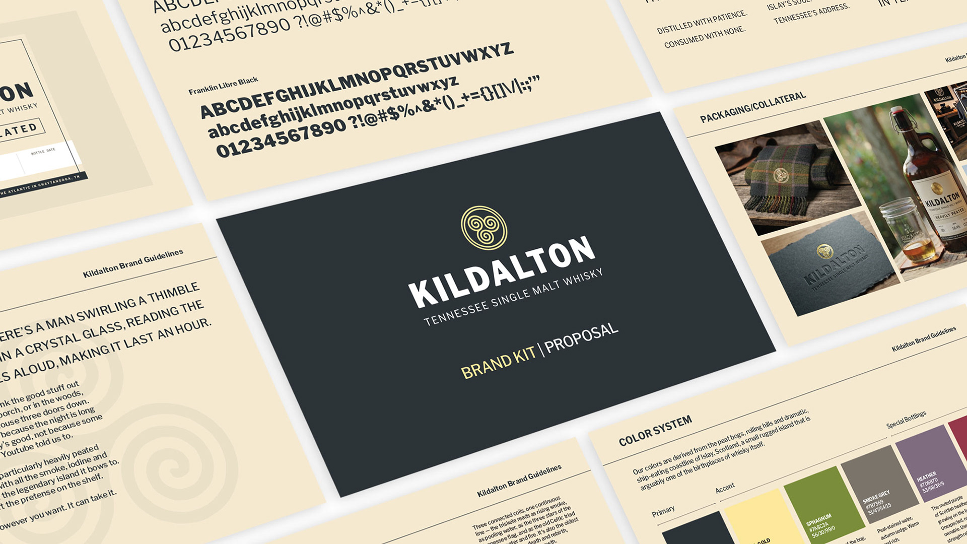
Kildalton Tennessee Single Malt Whisky
Designer/Distiller/Brand Architect
I make this whisky. That's where this project starts. I designed a label I wanted to put on a few bottles and then I started wondering about how far I could take that idea.
Kildalton is a heavily peated single malt whisky made from 100% imported Scottish peated barley, with water adjusted to mirror the chemistry of the stream that feeds the Laphroaig distillery on Islay. (It's very soft water.) Every production method has been researched and replicated as closely as possible. To be clear, you cannot clone whisky. The final output is determined largely by still geometry and aging environment. A basement in landlocked Tennessee, with it's big seasonal temp swings is a massive difference from a stormy, salty seaside cask house. This however is the also the point of the whole thing. I love the idea of making my favorite Scotch whisky and seeing what it tastes like over here.
And what it tastes like is not for everyone. It's earthy, briny, smoky...band-aidy. Tastes like a dragon set fire to a hospital ship in the Atlantic.
Islay Scotch in general is in my opinion the most interesting, complex and delicious whisky on earth.
Islay Scotch in general is in my opinion the most interesting, complex and delicious whisky on earth.
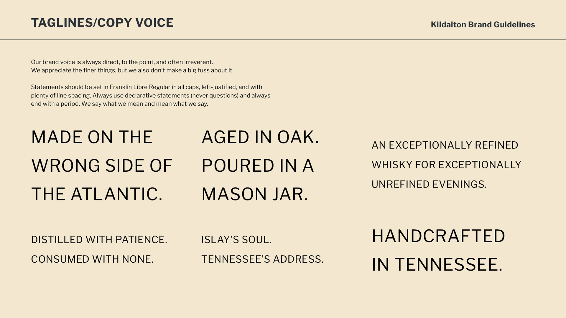
Building the brand for something you actually make is a different experience than any client project. There's no brief, no stakeholder, no compromises. There's just the question of what this thing actually is and how to tell that story the right way. That's evolving. This is round one. The vibe is more or less that the brand has to seem serious enough to let someone know they were getting something really nice that's also different from bourbon, and relaxed enough that it could (should) be drunk out of a mason jar without irony. It's how my friends and I hang out. Phone pic to the group chat of a bottle, followed by "Hey look what I got."
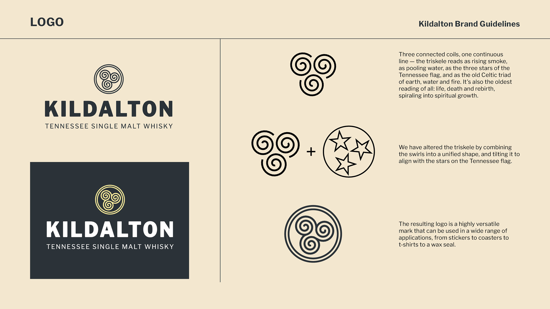
The mark is based on a particular Celtic knot called a triskele. Three coils. This one has them interconnected into a triple spiral and tilted to align with the three stars on the Tennessee flag. It reads as rising smoke, pooling water, and the Celtic triad of earth, water, and fire simultaneously. It's also the oldest symbolic reading of all: life, death, and rebirth.
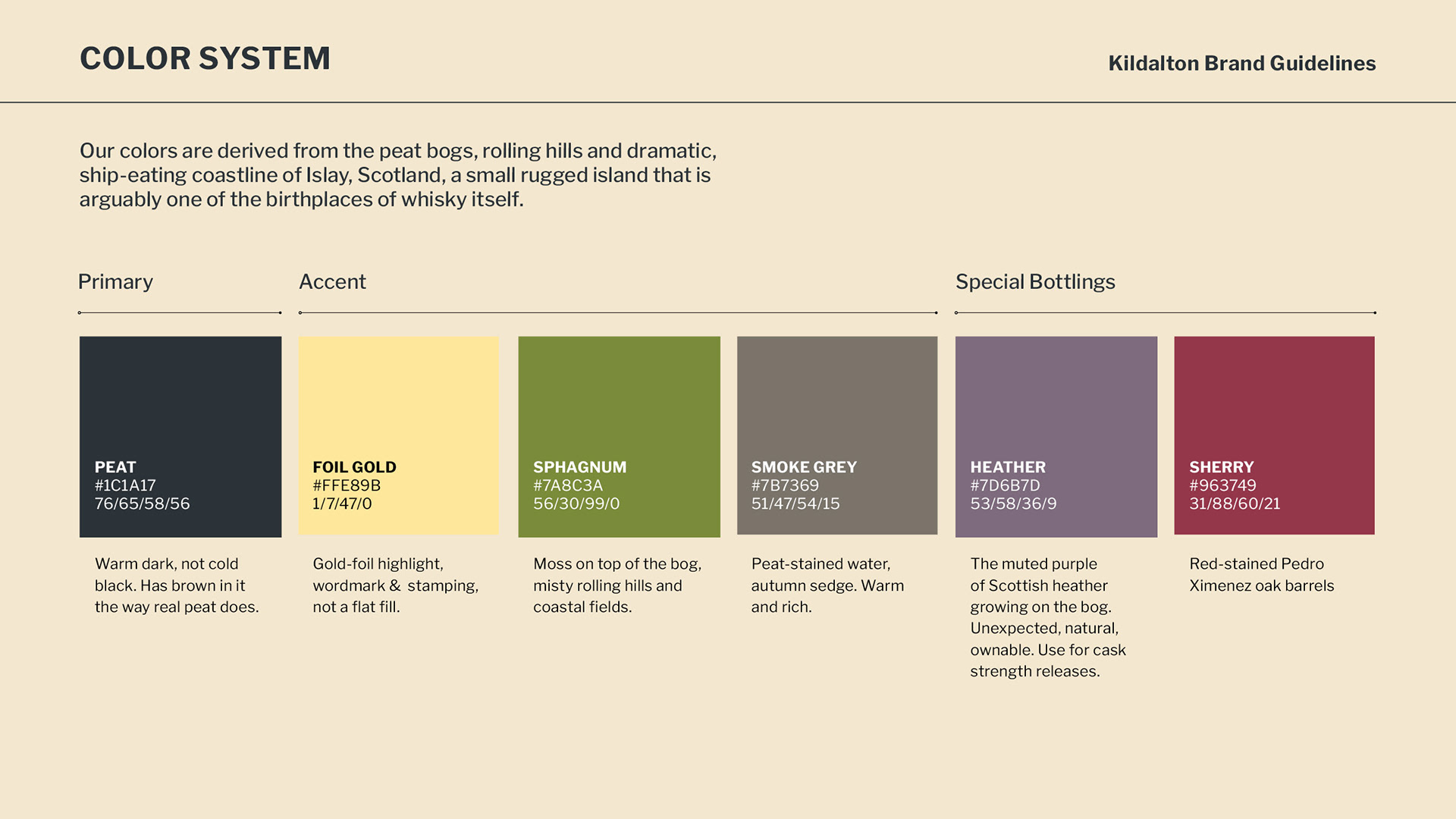
The color system was pulled directly from the source material: peat bogs, rolling coastal hills, bog water, heather, autumn sedge. Colors derived from the landscape the whisky nods to.
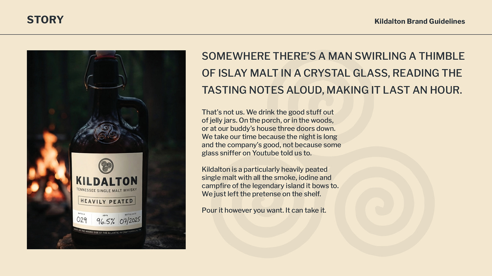
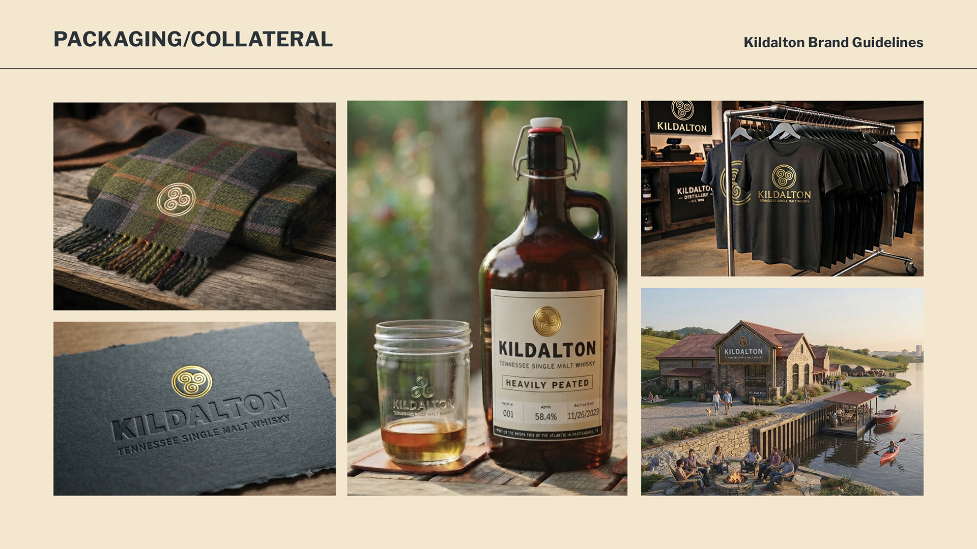
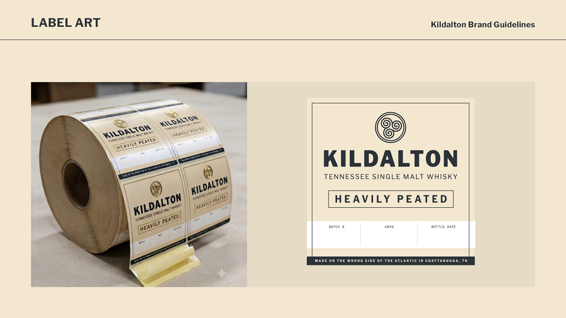
The packaging is something I am still working through. It's not quite there yet. I love the idea of using a swingtop growler as a bottle. Likely with a PTFE (teflon) seal instead of the red rubber. I plan to put this packaging together and shoot it myself. The label itself is not final art yet.