Home Depot Sign Standards Refresh
Associate Creative Director
Every design system eventually accumulates debt. Standards get bent for a vendor exception, then bent again for a seasonal initiative, then again for a new product category — and over time the system that was supposed to create consistency becomes the source of the inconsistency. That's where Home Depot's in-bay signage was when this project started.
My job, working alongside a Senior Art Director, was to clear the debt.
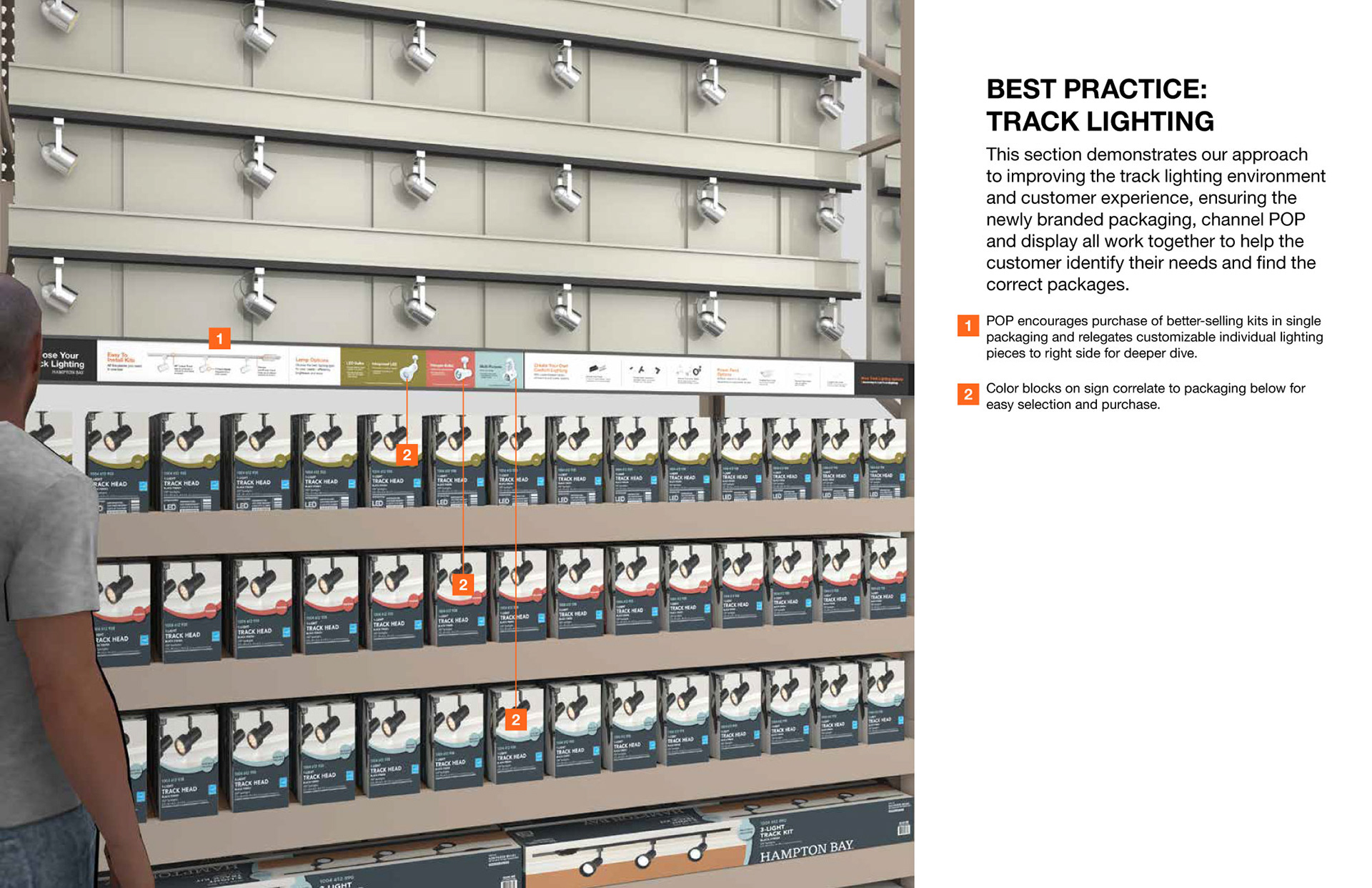
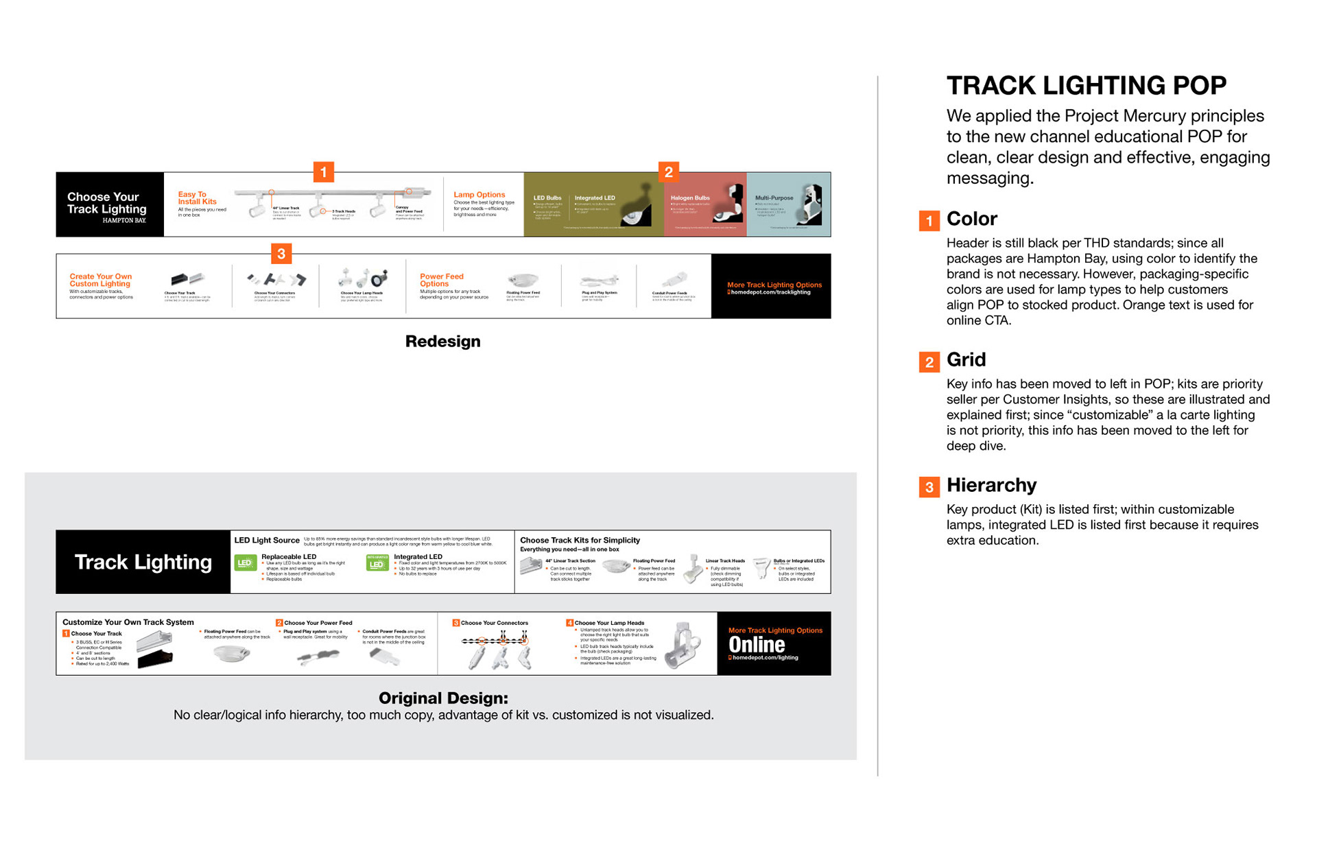
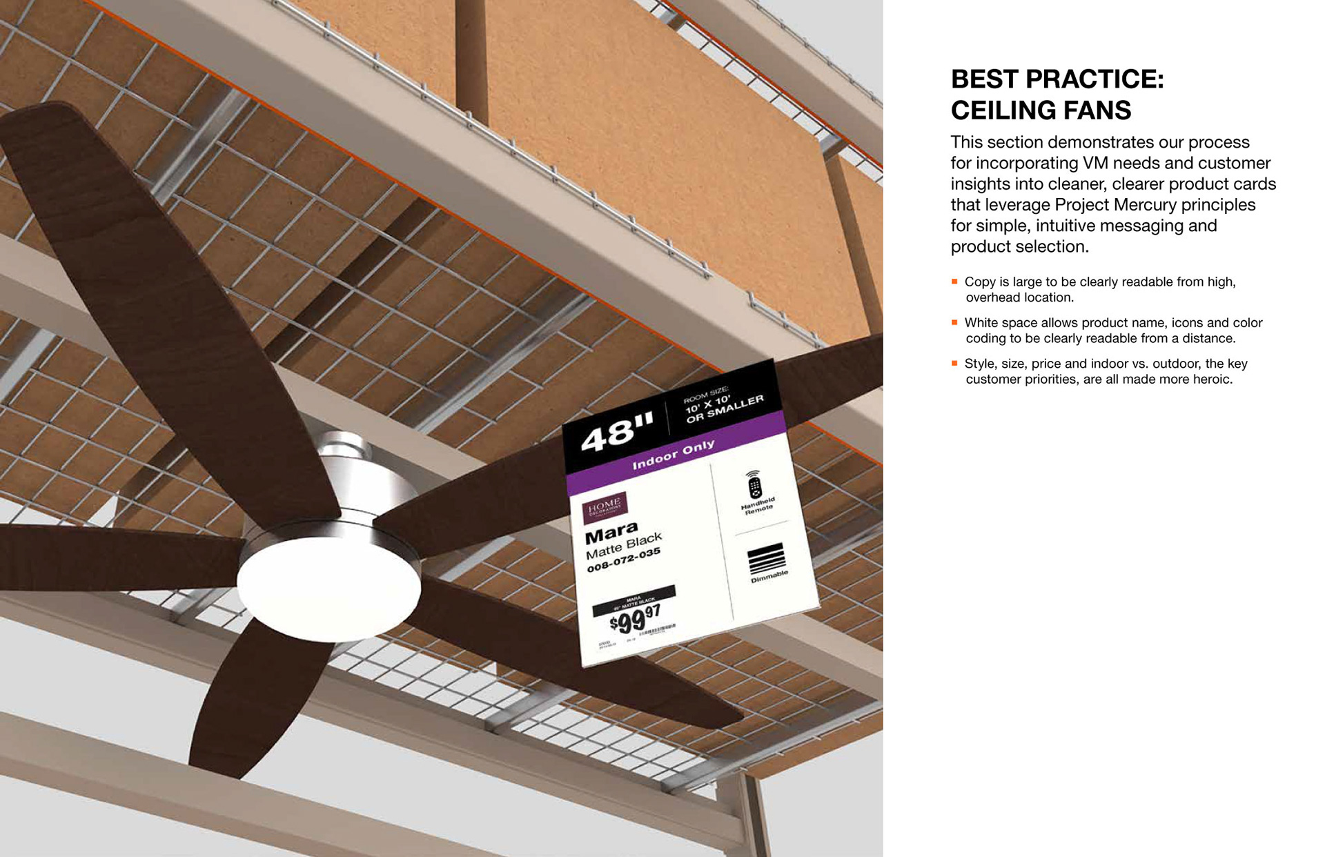
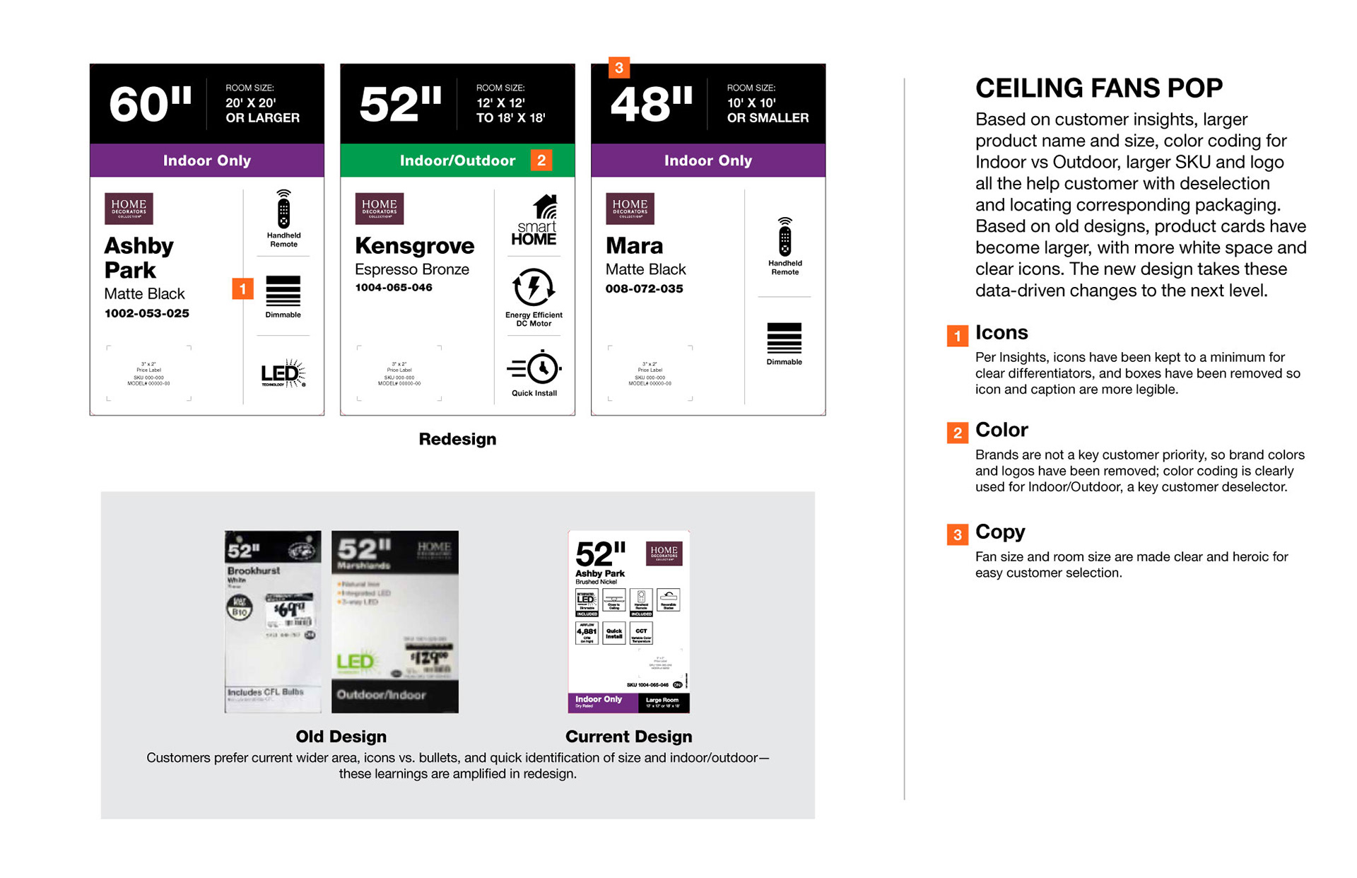
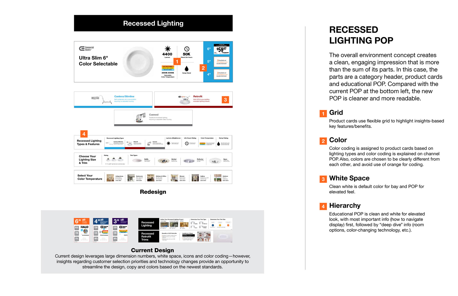
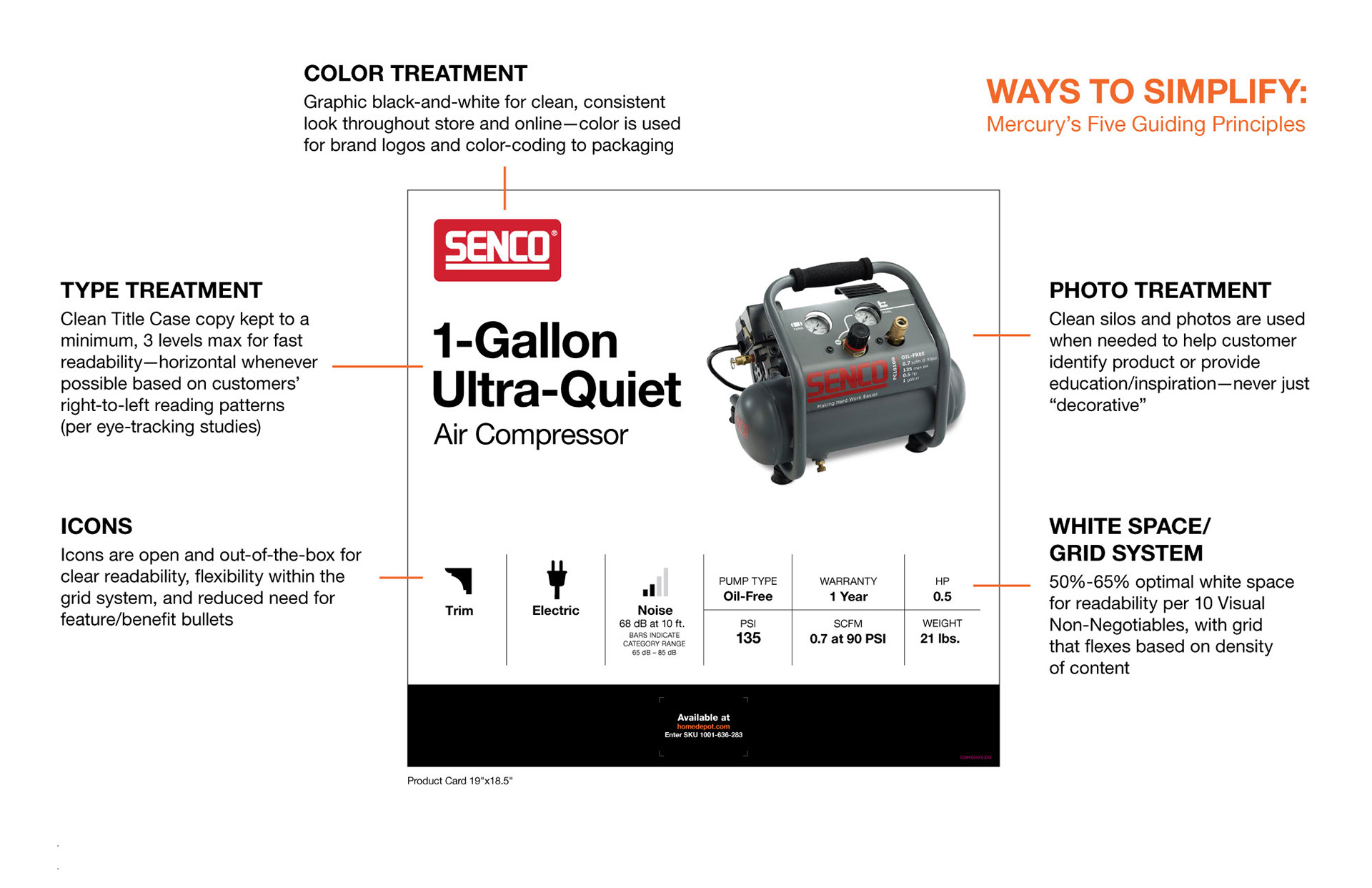
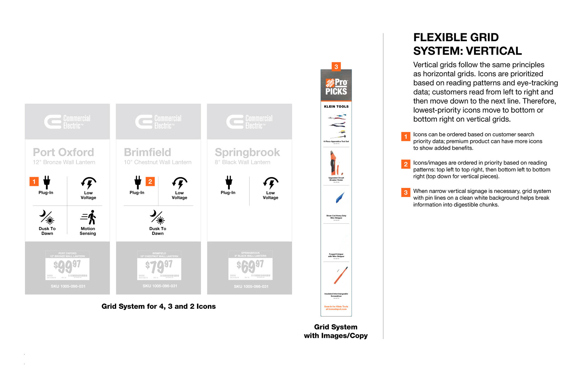
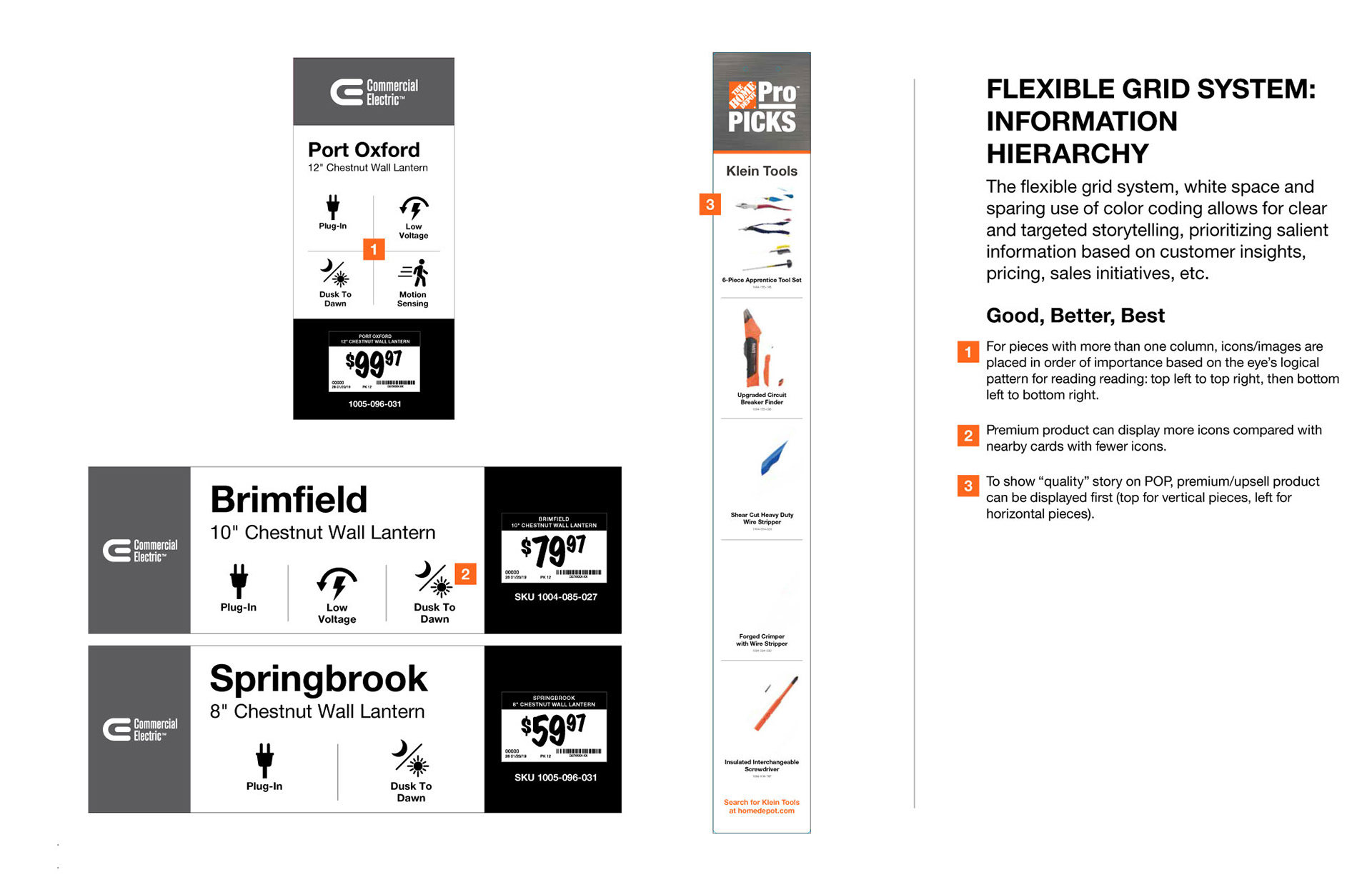
We didn't redesign from scratch. We went back to first principles and asked what a customer actually needs from a sign at the shelf level, and what they don't. The answer, informed by customer insights data and by a clear look at how people actually shop in 2020 and beyond, was simpler than what we had: the top three reasons to buy or not buy this product, a connection to online for everything else, and a clear path to delivery and installation options where relevant.
Nobody is reading a how-to guide off a sign. They're going to YouTube for that. So we stopped competing with YouTube and started doing the one thing a physical sign can do that a phone can't: intercept a customer at the moment of decision with exactly the information they need to take the next step.
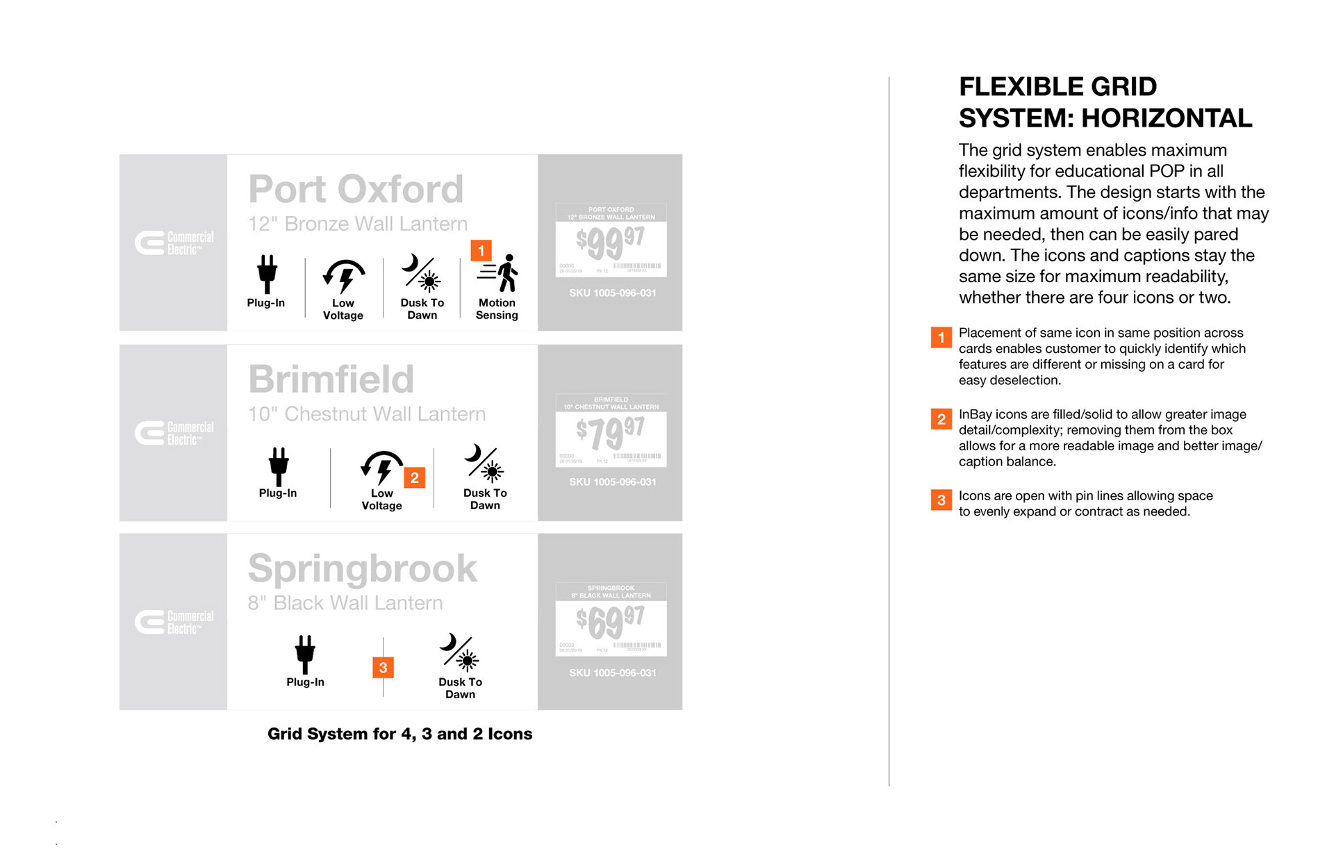
The system we built borrowed logic from responsive digital design — modular components that scale and adapt across product categories and sign formats the way a well-built web layout adapts across screen sizes. It was, as far as I know, one of the first times that thinking had been deliberately applied to a print retail environment at this scale.
We also had a defense mechanism. Working with the THD in-store leadership, we developed a ten-point best practices document that gave us something to hold up when clients inevitably tried to add back the complexity we'd removed. Design systems without institutional backing don't survive contact with stakeholders. This one would.
The operational benefit we hadn't fully anticipated: the system made our own production process faster. Every new project started with a defensible foundation before research even began.
Project Mercury is now fully encoded in Home Depot's Inbay brand standards.
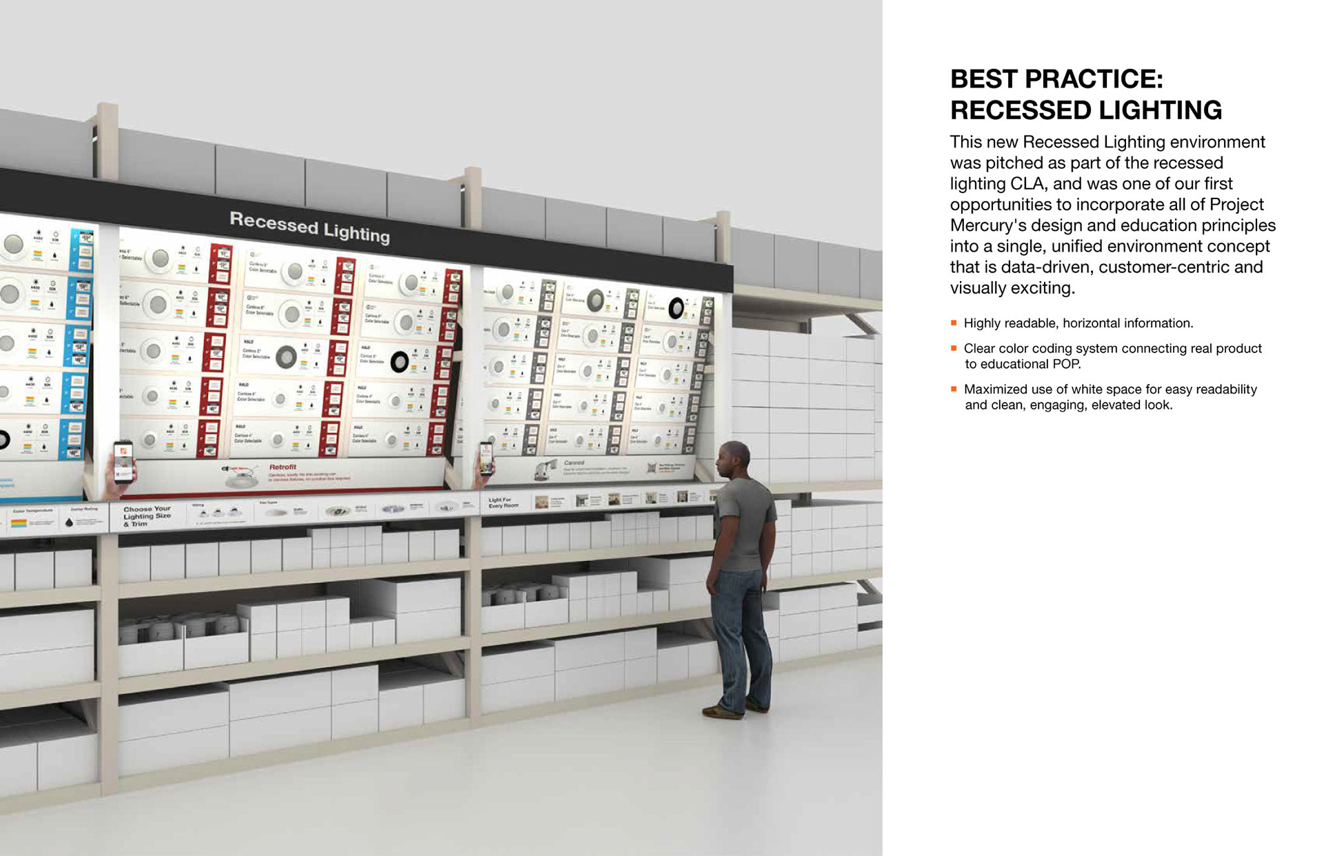
Our best case scenario layout showcasing Project Mercury
Responsive design, usually utilized in phones and tablets, deployed into a print environment
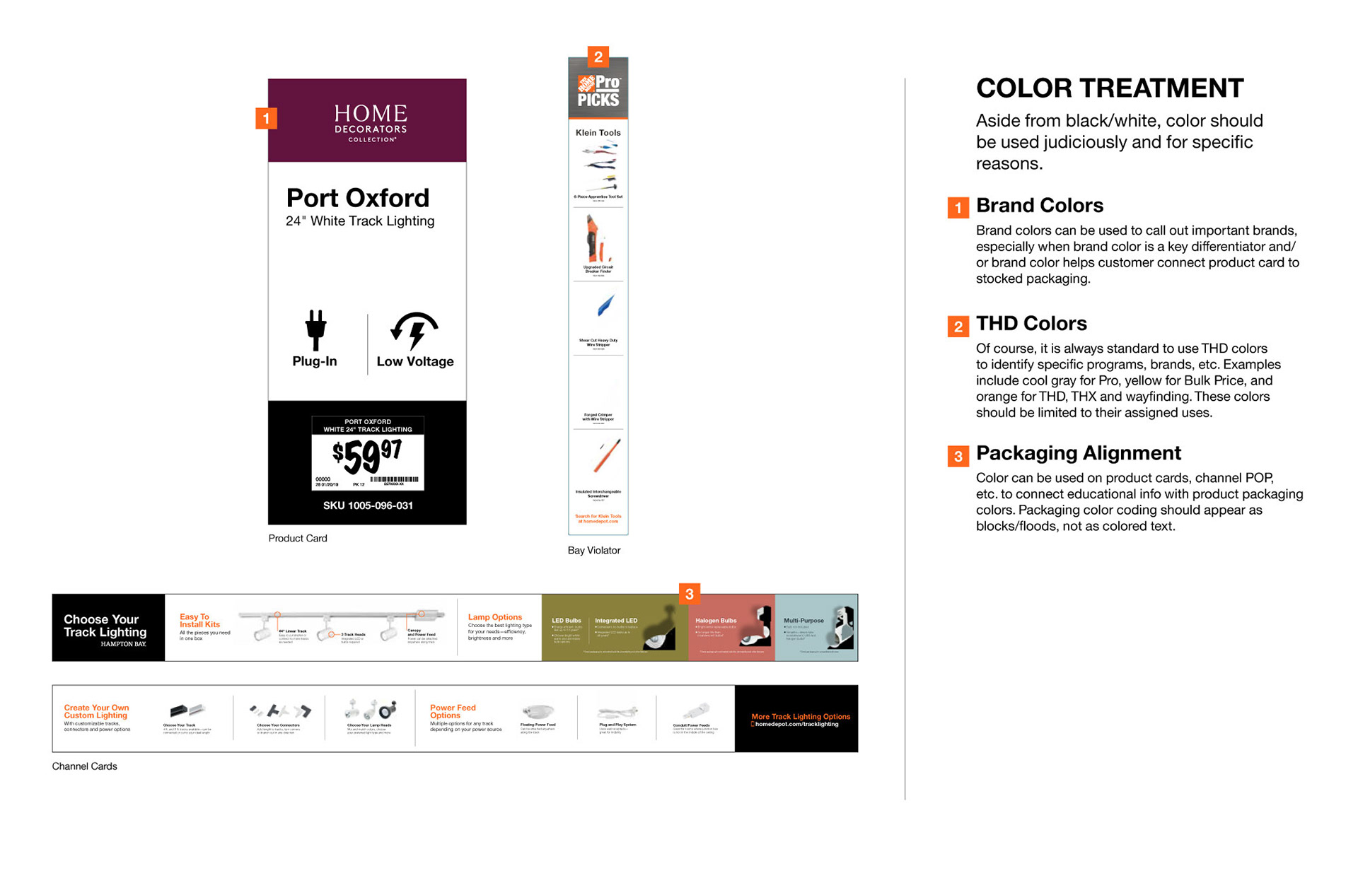
Reducing and reframing color use puts the focus on important messaging in a very cluttered retail environment
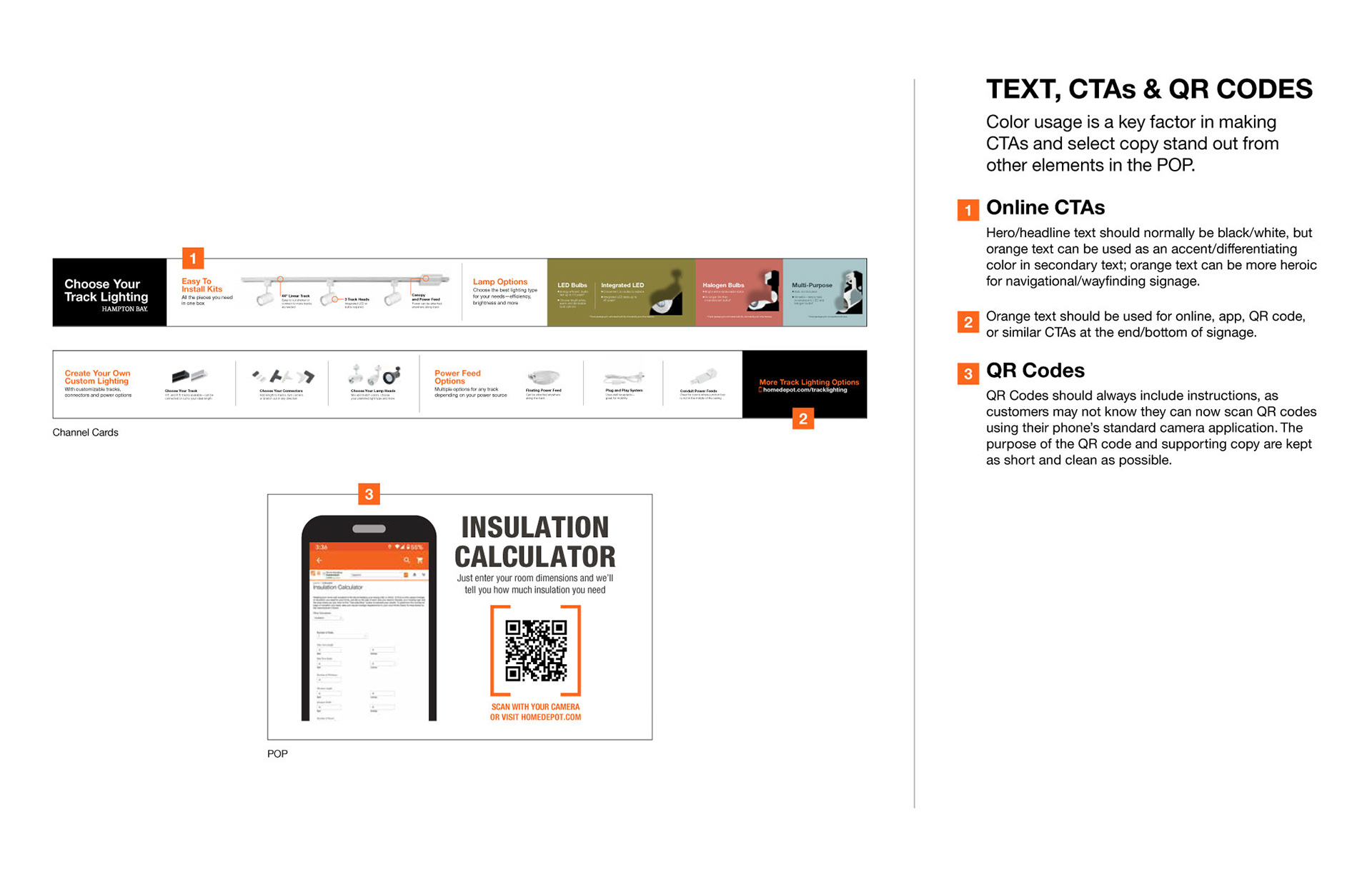
We made a specific choice to deploy the color orange in the store almost always as a navigation tool. Orange is the brand color but it's also the color that represents direct customer assistance. If you see the color orange in a Home Depot store, it is almost always directing you to where you need to go., both on and offline.