
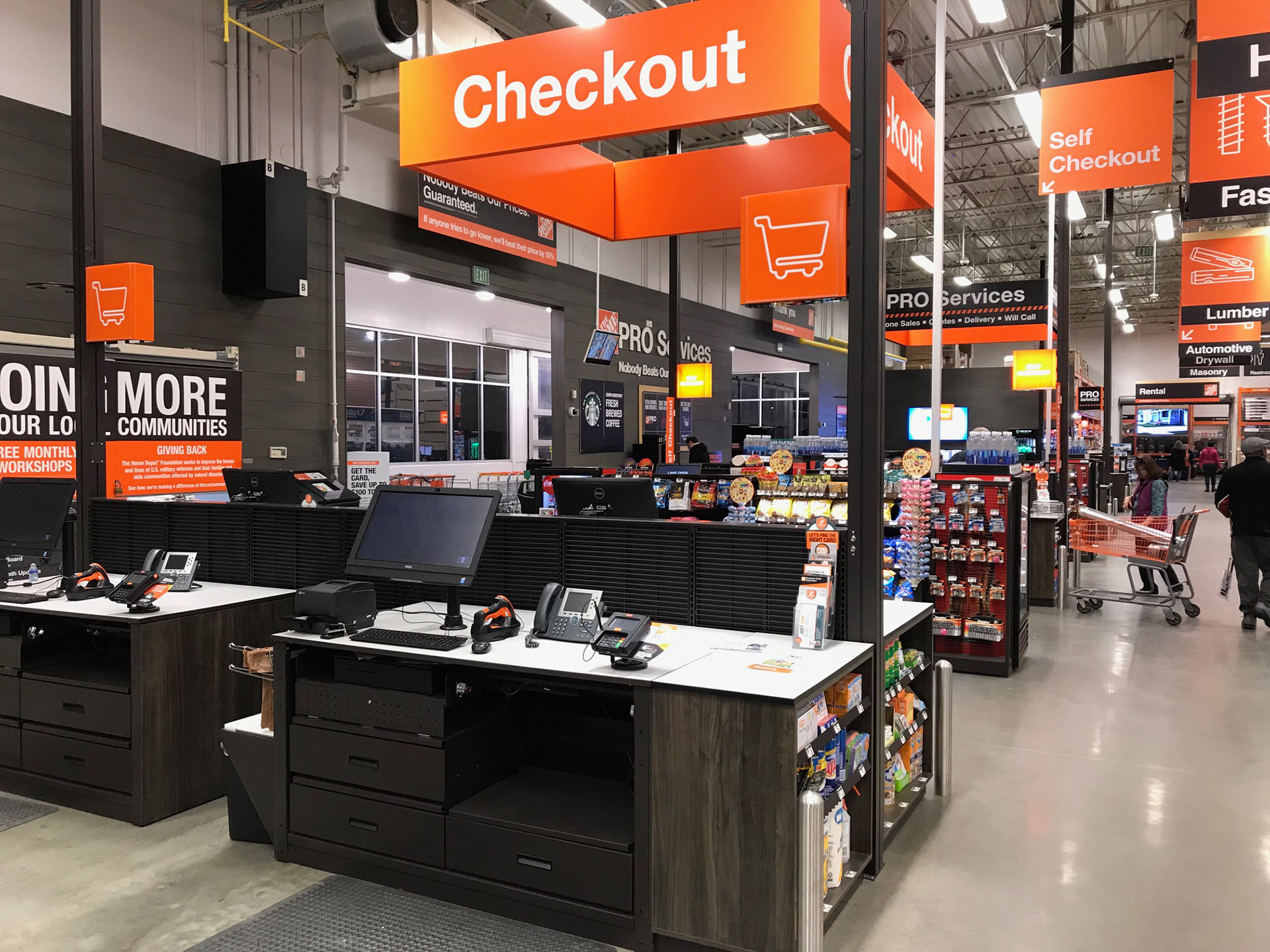
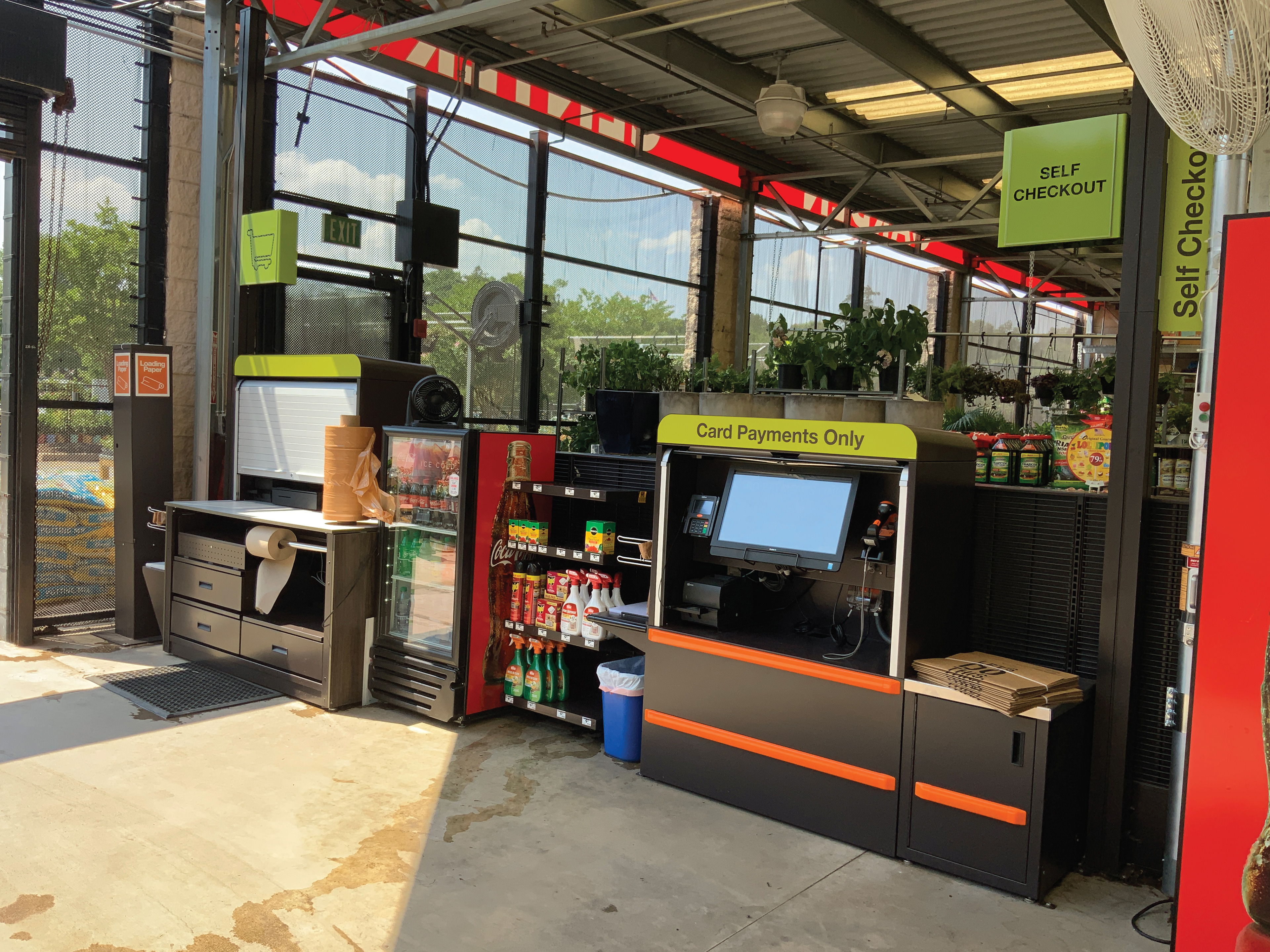
Minimizing POP around the Checkout area maximized navigational clarity and reduced associates' need to "direct traffic" to the Self Checkout corral in particular
Home Depot Front End Refresh
Art Director
The Front End of a Home Depot store is the highest-traffic zone in the building. Every single customer passes through it on the way in and on the way out. When it's working, it's invisible. When it's not, it costs the store time, associate labor, and customer goodwill. I've seen it go both ways.
By the time this project landed on my desk, the Front End had accumulated years of competing priorities. Self-Checkout, cashier lanes, Returns, Pro Desk, and Online Order Pickup were all fighting for the same physical space and the same customer attention. Associates were routinely stationed at the entrance to the self-checkout corral specifically to direct traffic, which was potentially an expensive human workaround for a wayfinding failure.
My job was to defrag it.
Working with senior members of the In-Store Experience team, I developed a communication system that imposed pretty clear hierarchy on a cluttered environment. Color-coded lane identification, four-sided hanging wayfinding visible from across the store, and a deliberate reduction of POP material that was adding noise without adding value. The goal wasn't to make it look better. It was to make it work better, and trust that clarity would take care of the aesthetics.
I spent a lot of time in stores after deployment, not so much as a researcher, but as a customer. What I noticed over visits to multiple locations was a consistent reduction in Associate presence at the Self-Checkout entrance. The two-person setup that had been standard with one directing traffic, one monitoring transactions had largely become one person doing both. The signs were doing the job the Associates used to do. We did the math and reducing staffing in that area to one Associate across all stores saves the company at least $50 million per year.
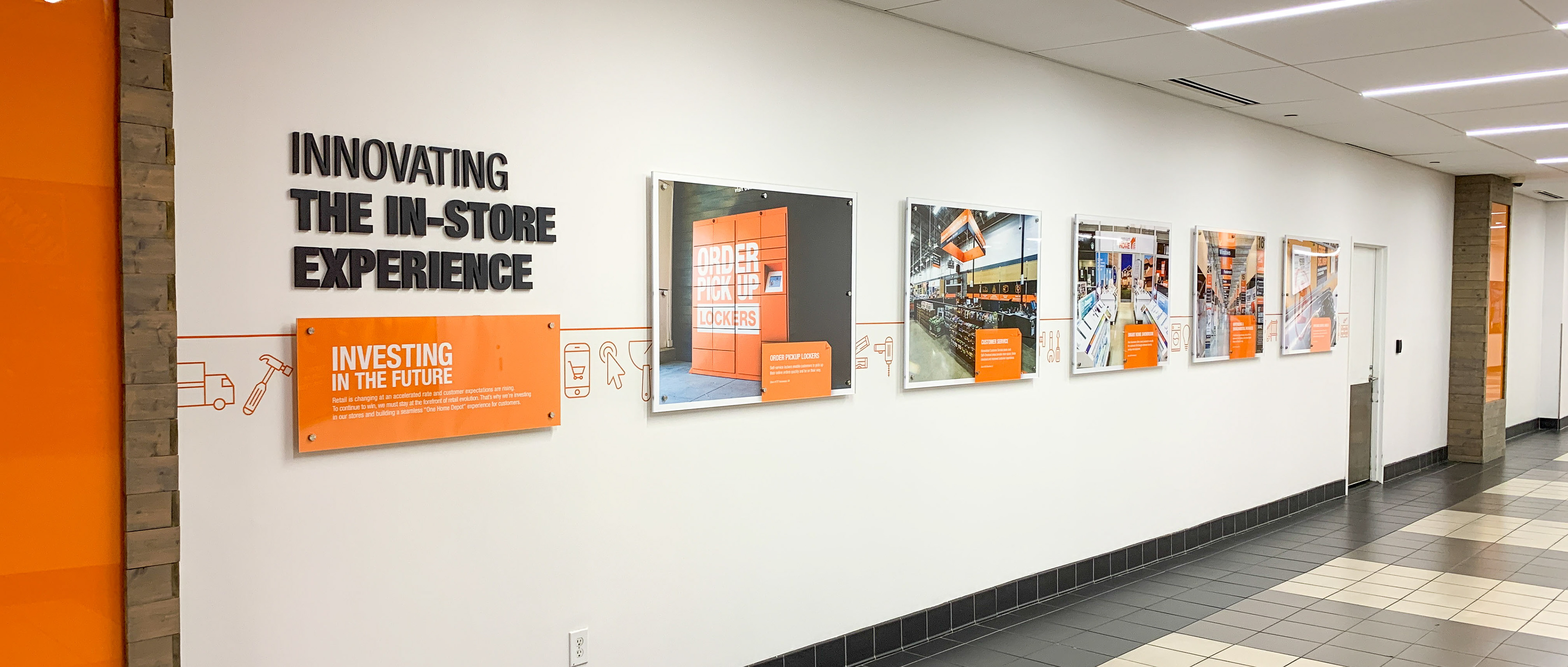
Wall at Home Depot corporate headquarters featuring my Front End and Order Pickup projects
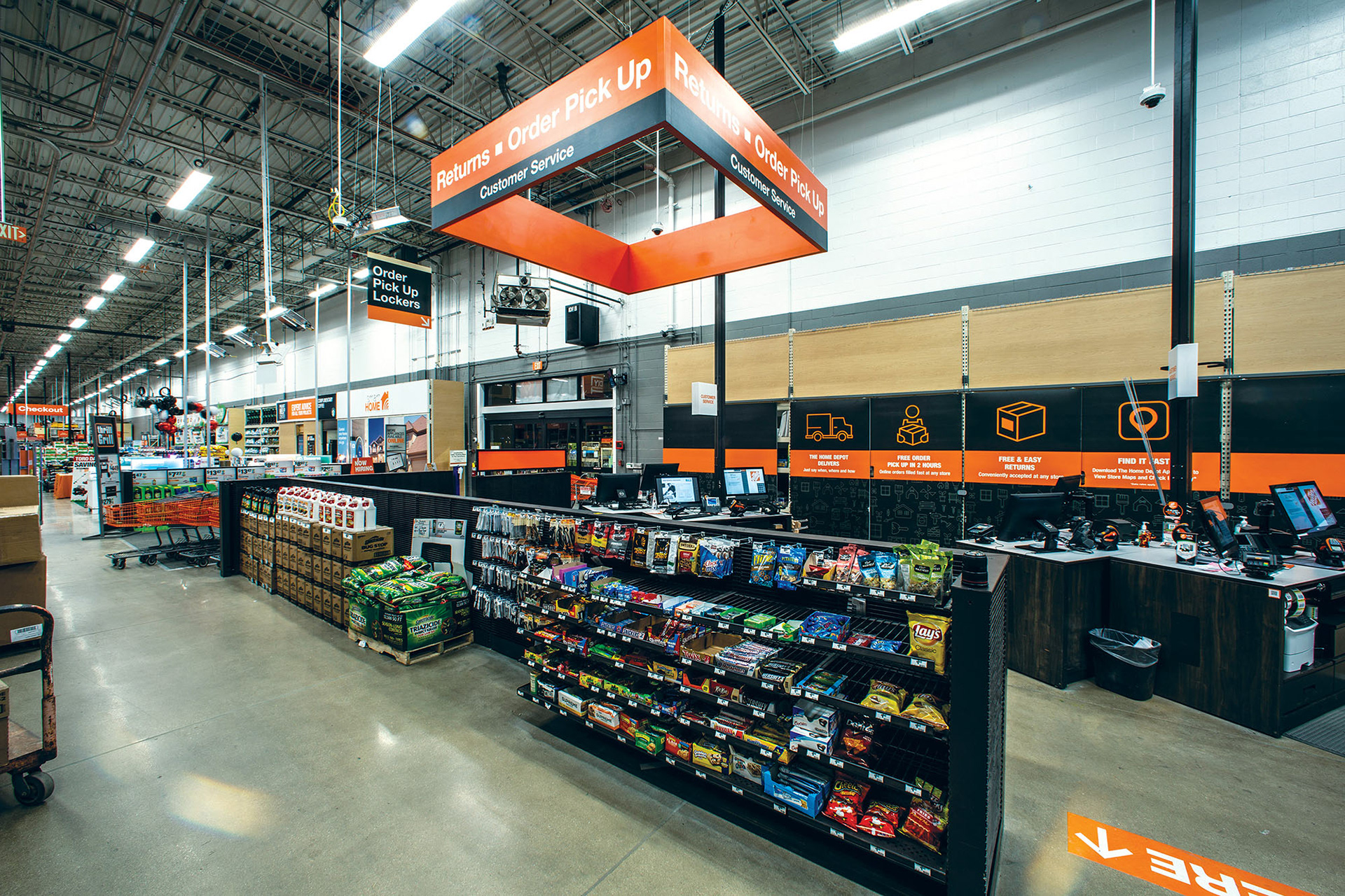
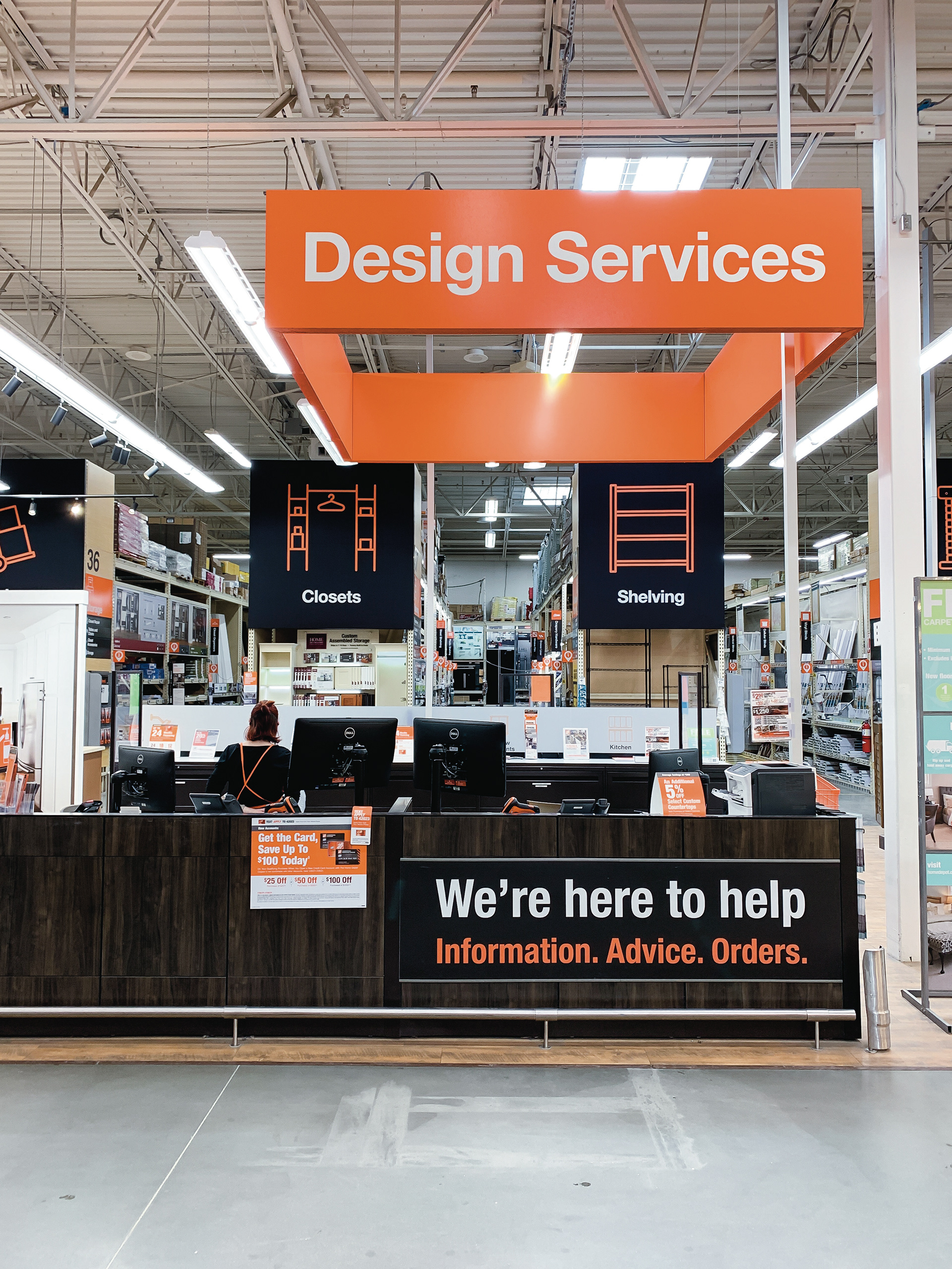
Four-sided hanging wayfinding ensures customers can locate key departments easily from afar
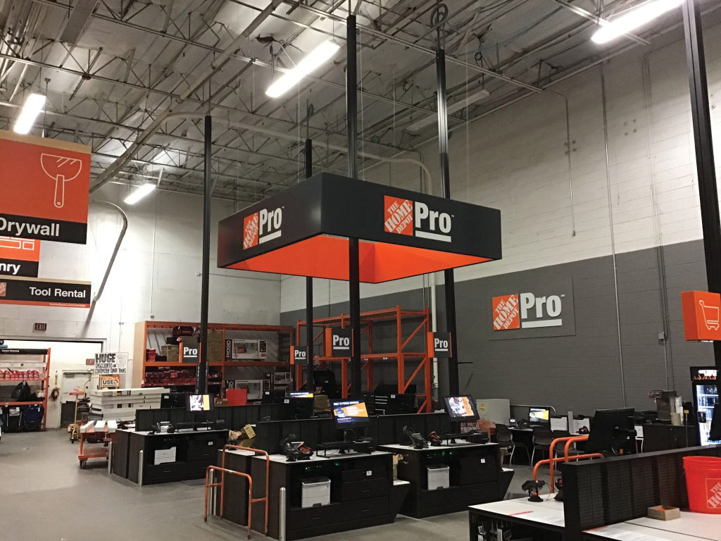
Wayfinding and checkout lane lamps were color coded for each department
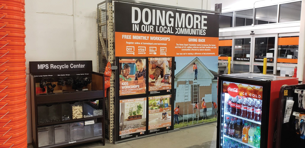
As pick tickets began to filter into the store, there was a need for an inventory cage near checkout. We leveraged the space to advertise THD's involvement in the community as well as free monthly DIY Workshops